Campus Engagement Platform
Designing an entire higher-education platform end to end — from the sales pipeline that sells it to the dashboard a student opens between classes. 11 modules, 4 audiences, one designer, ~6 months.
🔒 Under NDA — company & client branding in these screens is placeholder and will be redacted. This study shows the design work and the thinking behind it.

A Panel Everyone Worked Around
The existing platform had drifted into the classic campus-software failure: an admin panel IT tolerated and a student experience students ignored. The brief wasn't "make it prettier" — it was a list of things actively breaking for four different kinds of user.
It looked and felt like enterprise software from a decade ago. Students didn't open it — and a campus platform students don't open is just an expensive database.
Whole jobs the four audiences needed to do simply weren't there, or were half-built — gaps that pushed work back onto support and manual workarounds.
Permissions were a known pain point. In a system where a wrong permission means a student sees another student's data, that isn't cosmetic — it's trust.
The panel fell apart the moment you turned a phone sideways. On a campus, phones are where most of the audience actually lives.
What "Better" Actually Had to Mean
Not a feature checklist — a definition of what a fixed platform would have to deliver for each of the four people who depend on it.
One Product, Four Very Different Chairs
The "user" here isn't one person — it's four, pulling the design in four directions. A tool that delights the student can be a nightmare for the admin. Designing for all four, inside one product, was the whole job.
"I want to see the product, the price, and the contract myself — not sit through five sales calls to get there."
- Self-serve evaluation, on their own time
- Clear pricing and a demo without friction
"I'm managing hundreds of universities at once. I need to see exactly where each one is and move it forward — fast."
- A dense, scannable pipeline with real filters
- Quote and contract, tracked in one place
"I have to set who can do what across 40,000 people. One wrong permission and someone sees data they shouldn't."
- Powerful roles that are safe to operate
- Control over navigation, branding and SSO
"I just want to know what I owe, what's due, and where my next class is — on my phone, in ten seconds."
- Answers up front, not a menu to dig through
- Something worth opening more than once a week
Eleven Modules, One Lifecycle
The modules aren't a list — they're a relay. A university flows from a lead in a rep's pipeline, to a provisioned tenant, to a configured campus, to a student opening a dashboard. Six of the key surfaces:
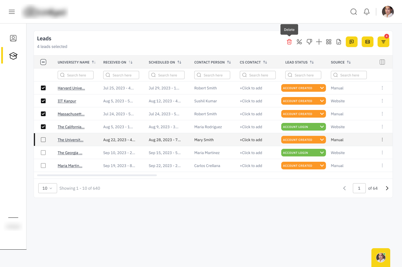
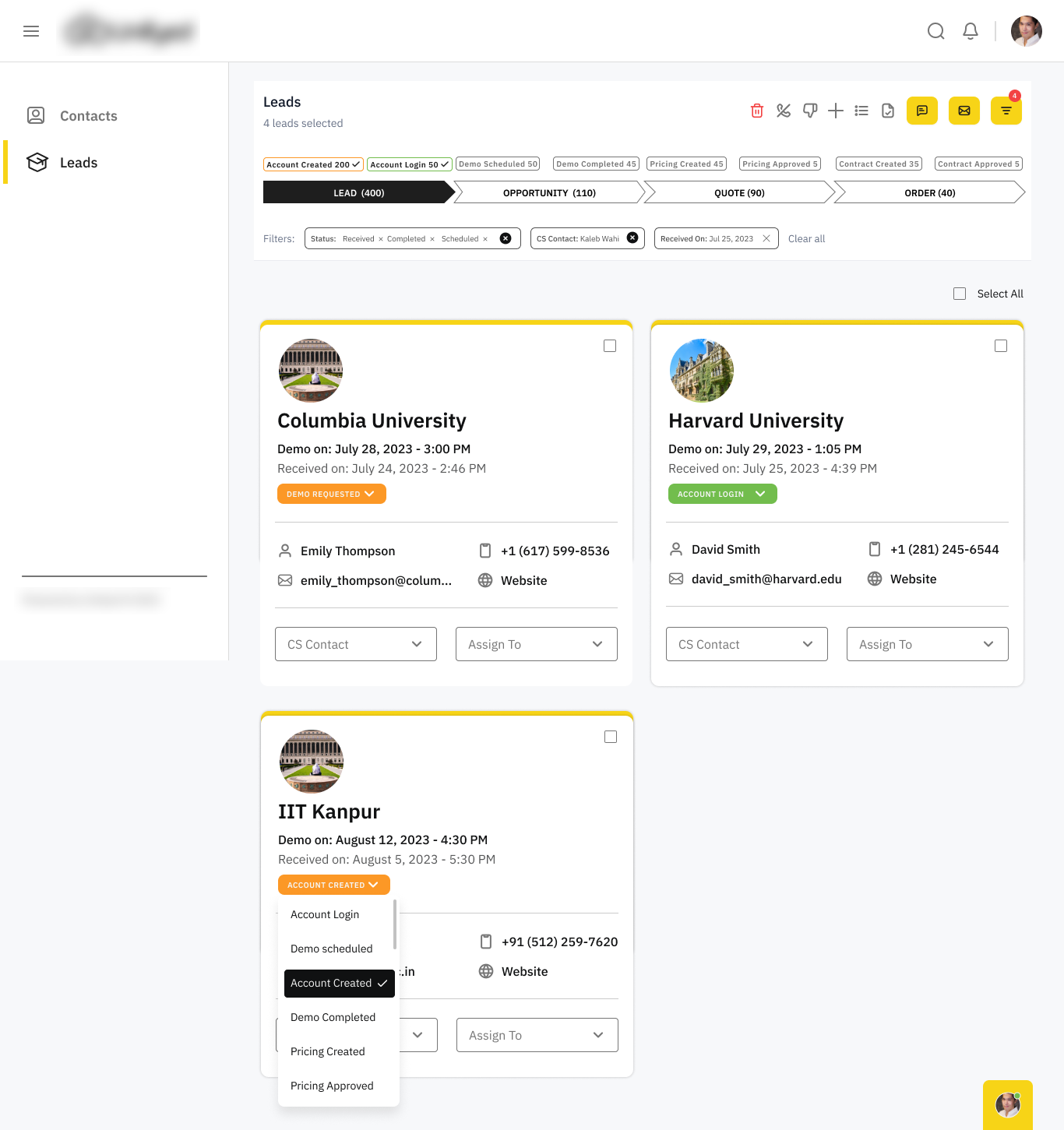
A Lead → Opportunity → Quote → Order pipeline with filters, assignment and a full lead-detail workspace.
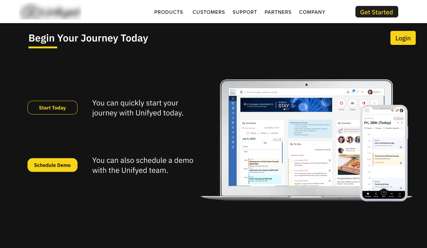
A 5-step tracker that lets a university register, book a demo, review pricing and sign — with no call required.
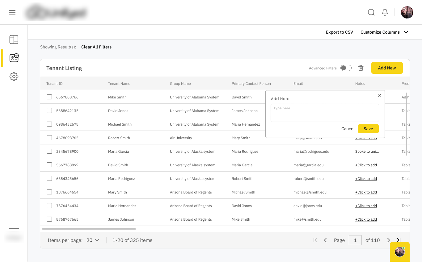
A 4-step wizard that stands up a brand-new university tenant — package, add-ons, usage and multi-year term.
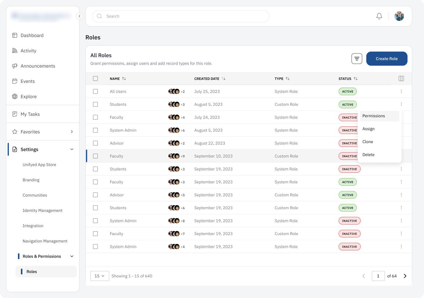
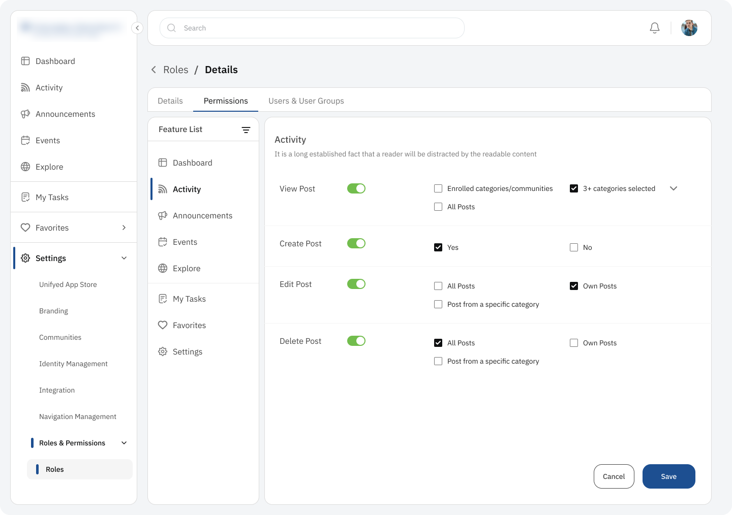
640+ roles made legible — split into who, what and to-whom, with a learnable verb-object-scope grammar.
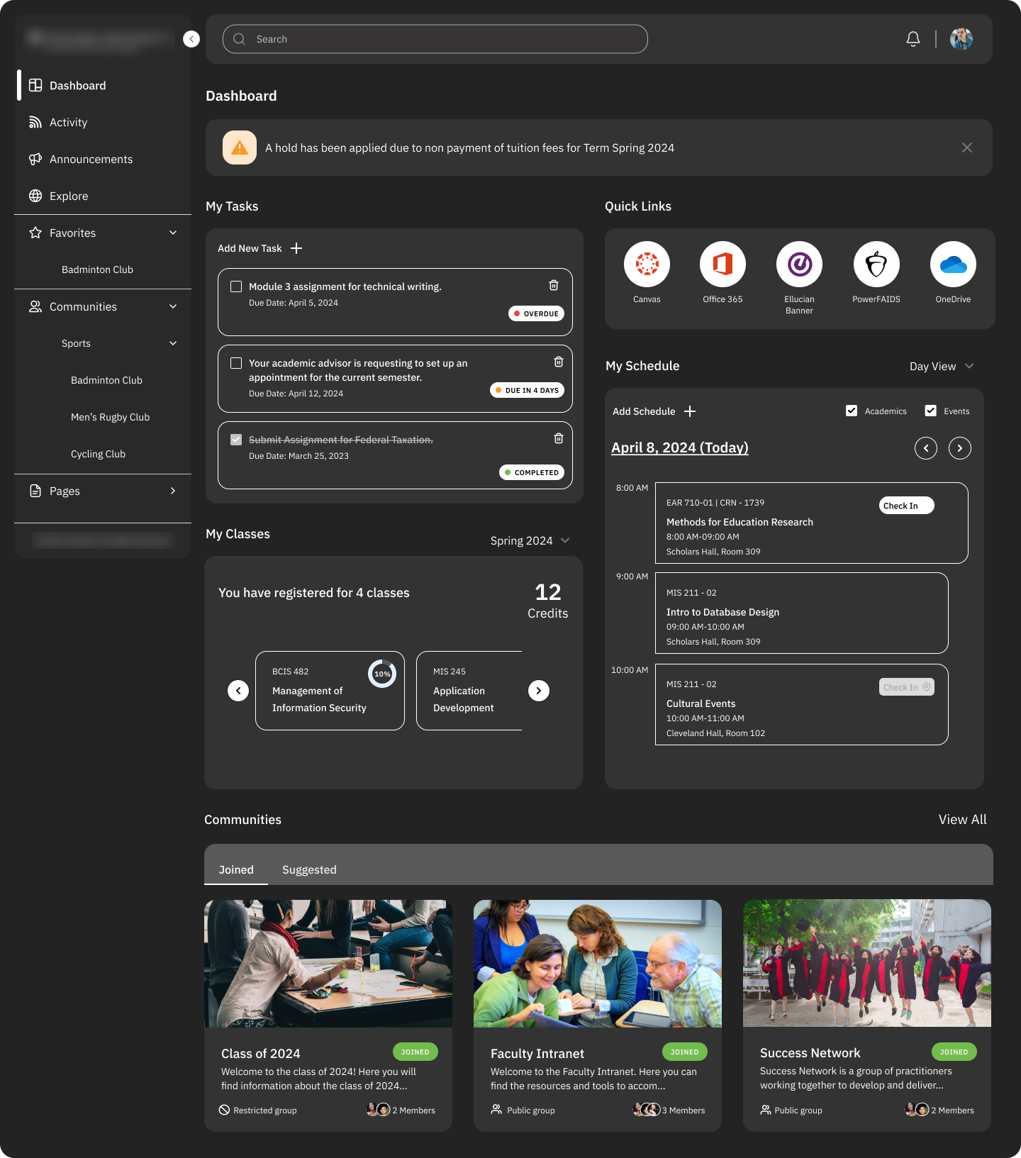
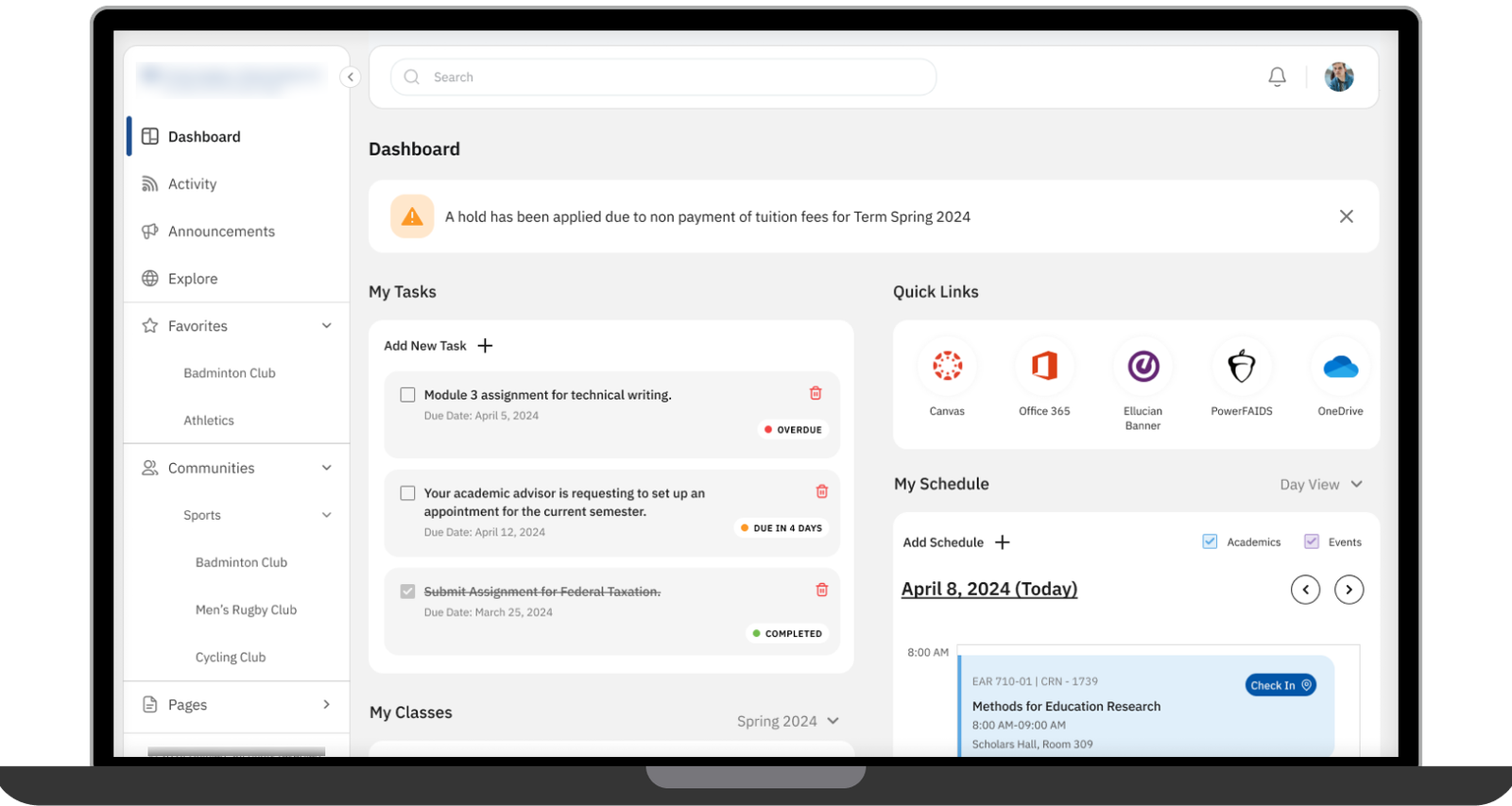
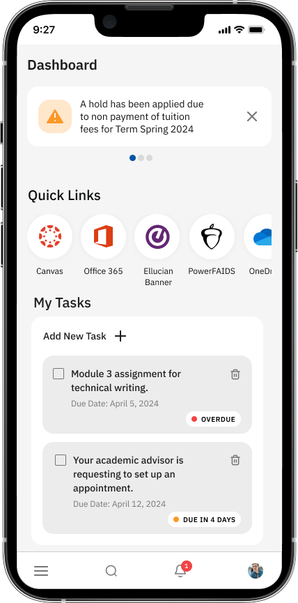
A briefing, not a menu — holds, tasks, classes and quick links, with full dark and lite modes.
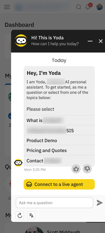
A campus social layer plus a conversational assistant that deflects routine aid, registration and IT questions.
One Journey, Designed From Both Sides

Why one state machine, not two products?
The sales pipeline and the prospect's self-serve signup are the same journey seen from opposite sides of the table. The easy version ships a CRM and a separate marketing funnel and lets them drift. I tied both to a single shared state machine instead.
- Same eight stages, two front ends — dense and scannable for the rep, calm and reassuring for the buyer.
- "Publish" is the only bridge — no "let me email you the latest version"; the latest version is the one on the portal.
- A status can never say two things — the two people who care most always see the same truth.
- Opposite density targets, one model — the real work was serving both without forking the data.
Four Surfaces, One Design Language
Lead-to-Contract CRM
A pipeline that lets a small internal team move hundreds of universities from first touch to signed contract.
- Segmented Lead / Opportunity / Quote / Order stages with real filters
- Lead detail: requirements, demo, a multi-year quote builder, and contract
Roles & Permissions
640+ roles turned from a wall of checkboxes into three calm tabs and one repeatable grammar.
- Split into who (details), what (permissions), to whom (users & groups)
- A verb · object · scope grammar — own / a category / all — learnable once
The Student Dashboard
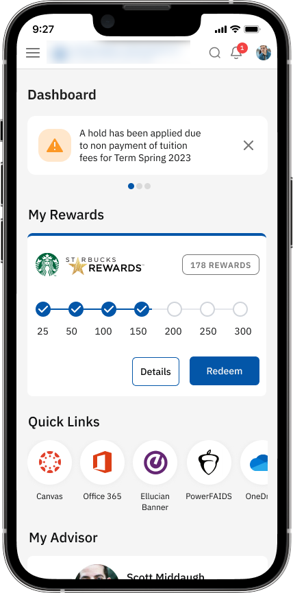
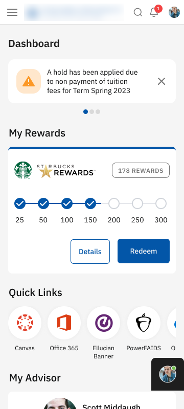
A briefing that answers the student's real questions before they go looking — the module that makes the platform worth opening.
- Holds and dues surfaced first, not buried
- Schedule with check-in, tasks, balance, rewards and quick links in one view
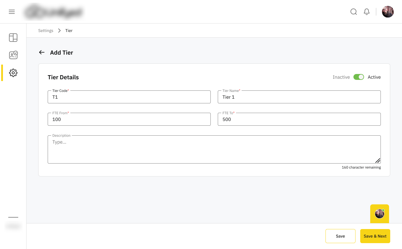
Tenant Onboarding
A 4-step wizard that turns a signed contract into a live, configured university tenant — the handoff where a clumsy design would leak.
- Details → contacts → package → term, one decision at a time
- View / edit modes with unsaved-change guards on every step
The Same Product, Every Screen
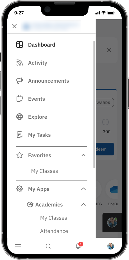
Students live on phones, so the layout couldn't just "not break" — it had to hold its shape. The dashboard, feed and AI assistant all reflow for mobile web, with dark and lite modes for real-world devices and connectivity.

The branding module ships a built-in WCAG contrast checker — when an admin picks the campus's brand colors, it tells them whether the combination passes before they publish. Accessibility becomes a guardrail enforced at the moment colors are chosen, not a hope.
From Lead to Lecture Hall
The full relay — the same university, handed cleanly from one module (and one audience) to the next.
Where a System Earns Trust
Four audiences means four times the edge cases. These are the moments where trust either gets built or quietly breaks.
640 leads or 640 roles, filtered to zero.
A clear reset action is always offered — never a dead end.
Deleting a lead, a role, or a nav section.
The same confirmation pattern everywhere — learn it once, trust it everywhere.
Leaving a half-finished role or tenant step.
"Save changes?" guards every multi-step flow before work is lost.
A brand-new tenant with no roles, no users yet.
New admins see what a feature does before being asked to configure it.
Wrong code, expired code, unregistered email.
Every error says what went wrong and how to fix it — with a resend timer.
Editing a role that shouldn't be edited.
System roles are always visibly marked, so no one changes one by mistake.
Insight That Points to an Action

Designed for the operator, not the analyst
An admin checking cohort health doesn't have time to cross-reference a report. Every element answers one test: does this tell them what to do next?
The at-risk students view pairs each flagged cohort with a plain-language reason and a recommended next step — so the operator sees where to act, not just what happened.
The Shape of What Shipped
Under NDA I can't share the client's numbers, and I won't invent a "+37% engagement." So these are scope facts, not outcome percentages — an honest picture of what one designer delivered end to end.
What changed, plainly: the platform went from a panel people worked around to one coherent, responsive system that gives each of its four audiences a job that's actually doable — sell it, provision it, administer it, and study inside it. The numbers I'd instrument first are student weekly-active rate, admin time-to-configure a tenant, and self-serve lead-to-demo conversion — one for each half of the bet.
I make data-heavy products clear and trustworthy.
I'm Ankur Bhatt — a product designer with 13+ years across B2B SaaS, logistics, e-commerce, and AI-driven tools. I build design systems and turn dense, high-stakes screens into interfaces people can operate under pressure.
I started in graphics, moved through web and three years of production frontend, then into product — so I read a decision from four sides at once: what to build, how it's built, what's right for the user, and what the business needs. On this project, that meant designing an entire platform's surface — sales, provisioning, admin, and the student app — as one system, alone, in about six months.
If you're building something data-heavy and want it to feel clear — let's talk.
Open to Senior / Lead Product Design roles — Delhi NCR, Remote, or Hybrid.